Climate change has long been a part of our daily lives and many of us can feel powerless and anxious about it. We might ask ourselves questions such as: Which areas of our lives are most harmful to the environment? Which policies and measures were implemented to combat climate change? How far are we from reaching the targets agreed on in Paris 2015? And where do I find all this information?
The European Environment Agency (EEA) took on the mission to bring more clarity into our lives by launching their new website to educate the general public. The institution gathers data from all countries in the European Union and produces assessments on several topics related to the environment. It provides verified and independent information for the measurement of Europe’s progress towards reaching our climate targets, and as the foundation for introducing new environmental policies and regulations.
This public institution serves as a source for reliable information, however understanding the provided data in its raw format can be challenging, if not impossible. Thus, the data needed to be transformed into a format that is understandable for everyone – and this is where the power of data visualisation comes into play. Over a whole year, Inviso by Devoteam has been building 16 interactive Tableau dashboards displaying relevant information on climate and energy in the European Union. The visualisations are embedded into the new Climate and Energy website of the EEA, located under Topics > (Topic) > Data tab. Through the encoding of EEA’s data into visual variables in nice and neat graphs, the website visitors are now able to grasp how Europe is performing.
Now, let’s have a look together!
Greenhouse gas emissions in the EU
Luckily, we can observe a steady decrease in Europe’s emissions over the last decades, and due to the introduced measures and policies, they are expected to continuously fall in the coming years.
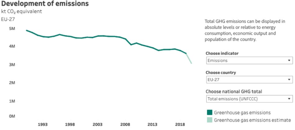
Source: climate-energy.eea.europa.eu/topics/climate-change-mitigation/greenhouse-gas-emissions-inventory/data
This view is quite high-level though, so let’s split it up into sectors to get a better understanding of how the different areas are contributing to the overall emissions. In the chart below, we can see that while the Energy Supply sector is the most emitting sector, it is also the sector that has seen the largest decrease in emissions.
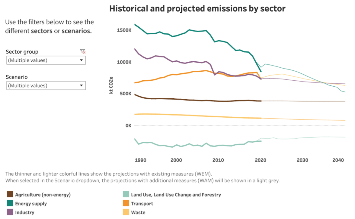
Source: climate-energy.eea.europa.eu/topics/climate-change-mitigation/projected-future-emissions/data
Energy sector
Different factors could have led to this relatively strong decrease in the Energy Supply sector – let me point out two possible explanations based on some other visualisations.
1) Rising carbon prices
In the following chart, we can clearly see the increase in the carbon price over the last years (black line on the first chart). This development has resulted in a steady decrease in the usage of solid fossil fuels (coal) in the power sector in order to be more cost-efficient. Since the use of coal is a highly emitting activity, the change to using less coal and instead increasingly natural gases, other fossil fuels, and renewable energy sources (which are not included in this visualisation) has likely been contributing to the drop of emissions in this sector.
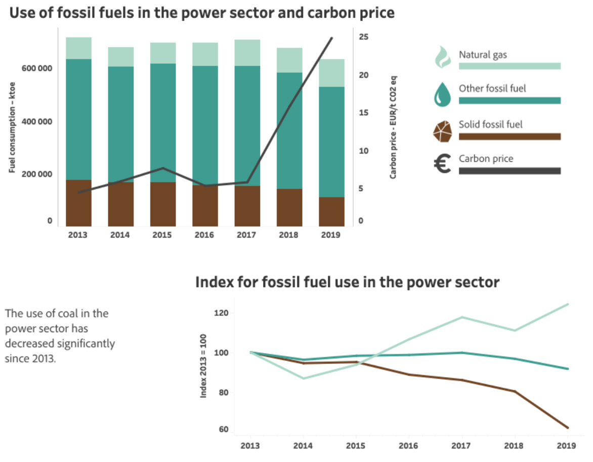
Source: climate-energy.eea.europa.eu/topics/climate-change-mitigation/european-trading-system-emissions/data
2) Energy Consumption and Energy Supply have been the most popular sectors for implementing policies and measures in the EU
All Member States in the EU continuously plan and introduce new measures and policies to reach their climate targets. The visualisation below illustrates that 22,8% of all these measures and policies implemented in the EU were in the Energy Consumption sector, followed by 19,7% in the Energy Supply sector. The priority of implementing policies in these sectors was probably due to the high emissions and, luckily, we can see the effects they have had on reducing emissions.
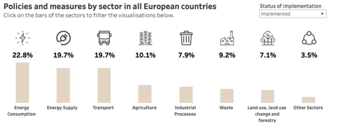
Source: climate-energy.eea.europa.eu/topics/climate-change-mitigation/policies-and-measures-to-reduce-emissions/data
Transportation sector
As we can see in the graph above, the power sectors are directly followed by the transport sector (19,7%) which includes aviation, road transport, and navigation (ship transport). Let’s do a deep dive into this category, and let’s start with aviation.
In the following graph, we see a clear tendency that we are flying more over the last years (illustrated by the dark red bar of verified emissions). In 2020, due to the impact of the COVID-19 pandemic, the emissions were lower than the total allocated allowance for the first time since 2013. It is however expected to recover to the old trend of increasing international aviation.
Source: climate-energy.eea.europa.eu/topics/climate-change-mitigation/european-trading-system-emissions/data
To underline the strong rise in international aviation, we can have a look at the chart below describing the change of emissions between 1990-2019 in the different sectors. It shows an increase of 145% in emissions caused by the aviation sector in the last 30 years. Interestingly, there was an increase of emissions in all the transportation categories (domestic transport, international navigation and -especially- international aviation) whereas in all other sectors we managed to decrease our emissions. The increase in the category ‘Land Use, Land-Use Change and Forestry’ indicates that we have less forests in Europe today than 30 years ago (but more about that later).
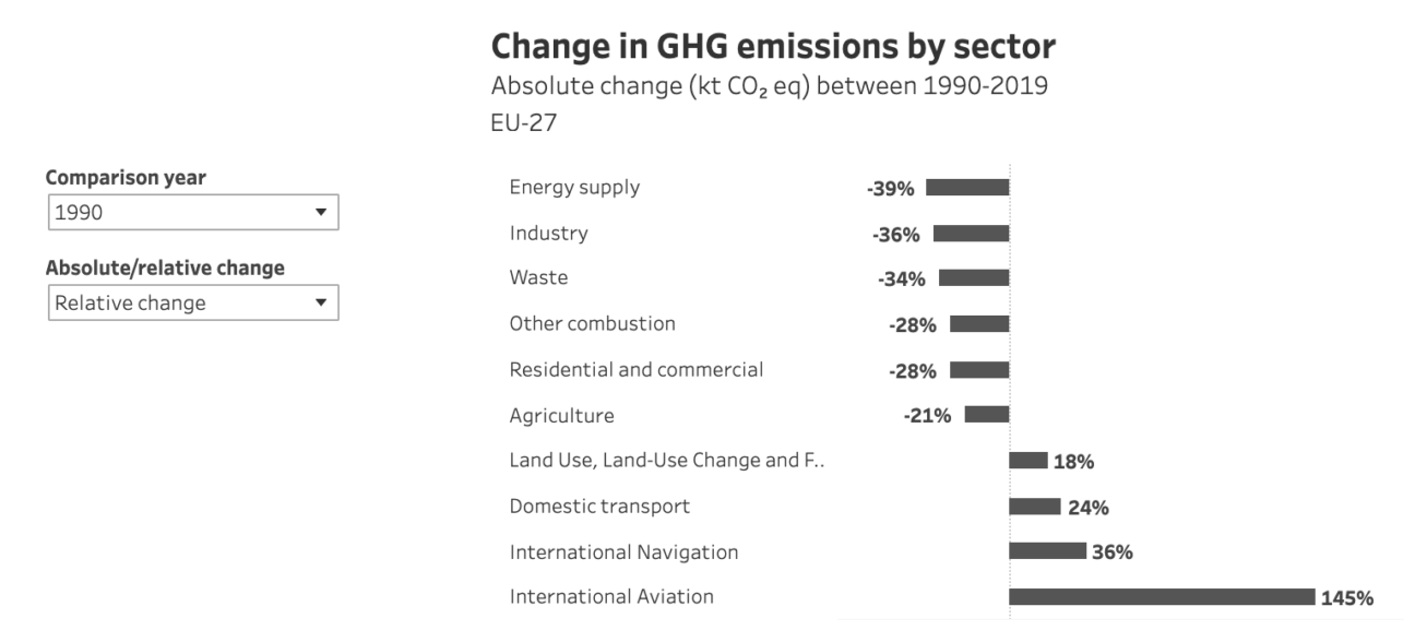
Source: climate-energy.eea.europa.eu/topics/climate-change-mitigation/greenhouse-gas-emissions-inventory/data
Let’s keep our focus on the transportation categories. We have seen the biggest relative increase in international aviation from 1990-2019, but we can see in the charts below that it is actually the domestic transport sector emitting by far the most greenhouse gases.
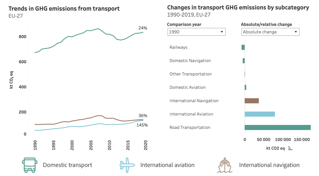
Source: climate-energy.eea.europa.eu/topics/climate-change-mitigation/greenhouse-gas-emissions-inventory/data
How can emissions be reduced?
Luckily, there are renewable energy technologies and natural weapons like forests to reduce our emissions. Let’s have a look at both to round this off.
Renewable Energy Sources
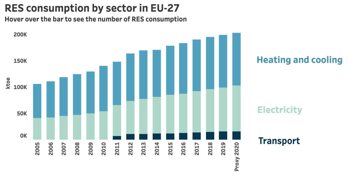
The graph below shows that there has been a steady rise in the consumption of renewable energy sources (RES). It also reveals that the transport sector is not using a lot of RES so far (dark blue bars).
Source: climate-energy.eea.europa.eu/topics/energy-2/renewable-energy/data
Land Use and Forests
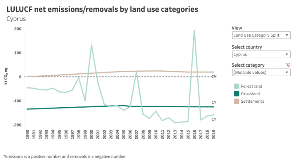
Our most powerful natural force to balance out these emissions are the plants and forests on our planet. To understand their importance, look at the chart below describing the greenhouse gas emissions and removals for different land categories in Cyprus over time. Removals, because plants transform greenhouse gases and remove them from our atmosphere. Thus, land categories like forest and grassland contribute negatively to the amount of emissions, whereas categories like cities (Settlements) add to the emissions. Are you now wondering how these extreme spikes in the forest land category (in the years 2000, 2007, and 2016) are clearly emitting CO2 instead of removing it? What we see here were severe forest fires, indeed releasing tonnes of CO2 instead of removing it. This tells us how harmful it is when our forests are burning, not only emitting a lot of CO2 through the fires but also destroying the most powerful machine to balance out our human-made CO2 emissions.
Source: climate-energy.eea.europa.eu/topics/climate-change-mitigation/land-and-forests/data
Let’s look at another example. Compare the two charts below showing the net emissions/removals in Czechia. Only five years separate the view in the left visualisation and the right visualisation, however, we can see an extreme change from Czechia being contributing negatively to the EU’s overall emissions (the country being green) in 2014 vs. adding a lot of CO2 emissions in 2019 (dark red). What happened to Czechia’s forests? The answer is a bark beetle plague, destroying Czechia’s forests and thus its most vital source for removing CO2 (source). Due to the hot and dry summers over the last years, the trees have a weaker natural defence system and thus easily fall victim to beetle plagues like the one Czechia is experiencing.
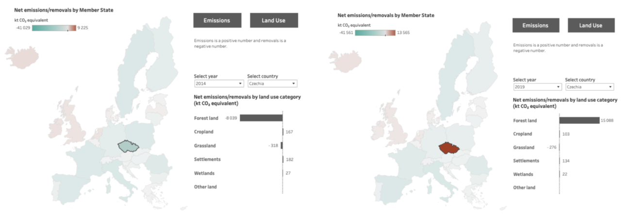
Source: climate-energy.eea.europa.eu/topics/climate-change-mitigation/land-and-forests/data
The examples of Cyprus and Czechia stress how important it is to take good care of our forests, so they continue to remove greenhouse gases from our atmosphere and slow down climate change.
While there is much more to discover and tell, I hope this post has served as a little appetiser on how to use the interactive dashboards.
Go and have a look yourself!